Especially when it comes to inspecting multivariate data, nothing beats the quick and easily-accessible information of graphical visualization. For an interval/ratio-scaled variable depending on two nominal variables, use the function interaction.plot. This function takes at least three arguments:
That means you can choose one of two formats, depending on which independent variable is shown on the x-axis and which is shown with different lines.
Gries recommends always generating and inspecting both graphs because he usually finds that one of the two graphs is easier to interpret than the other.
> interaction.plot(xfactor, tracefactor, response); grid()
ln Fig. 16 you find both possible graphs for one data set. Here, uhm behaves differently from uh and silences: the average lengths of women's uh and silence are larger than those of men, but the average length of women's uhm is smaller than that of men (Gries 2009b: 135f.). It should be noted that continuous values between the categories of nominal variables, as suggested by the lines, cannot exist, which has to be kept in mind for the interpretation of the graphs. The argument grid() is self-explanatory: it draws a grid into the panel.
Since the interaction plot only shows the means of the data set’s possible combinations, I would like to indicate again that means and measures of dispersion should always go together. The mean alone does not give you enough information about your data in order to draw meaningful conclusions.
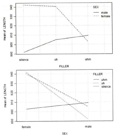
Fig. 16: Interaction plot for LENGTH~FILLER:SEX (Gries 2009b: 136).
A boxplot is another graph that allows data sets with several independent variables, combined with an asterisk for the interaction (Gries 2009b: 137, Baayen 2008: 80):
> boxplot(dependentvariable~independentvariable1*independentvariable2, notch=T)
In Fig. 17, for example, the word frequencies for 81 English nouns are shown distributed for the subsets of simple and complex words cross-classified by class (plant vs. animal). The most apparent feature of the plot is the varying distribution of frequencies for animals and plants for simplex words, with the plants having lower frequencies than the animals (Baayen 2008: 79).
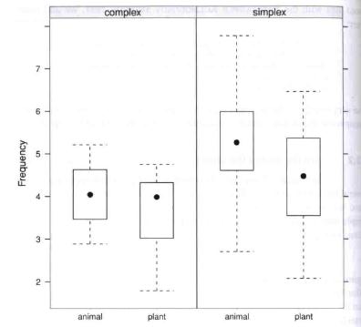
Fig. 17: Boxplots for frequency as a function of natural class (animal vs. plant) grouped by morphological complexity for 81 English nouns (Baayen 2008: 80).
Created with the Personal Edition of HelpNDoc: Free Kindle producer