Notes:
Computing the average of averages is as simple as pooling. You must first calculate the average use of the linguistic variable for each individual informant and then calculate the overall average value of these averages.
Once you have computed the personal averages per person and entered them into a data sheet, you can move on with the calculation in the same way as you did when you conducted ‘Pooling’.
Now that we have five different time periods, we can analyze them all at once and try to see variations and trends in the development of the mean.
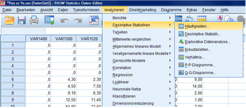
Open 'Analyze' … 'Descriptive Statistics' … 'Frequencies'
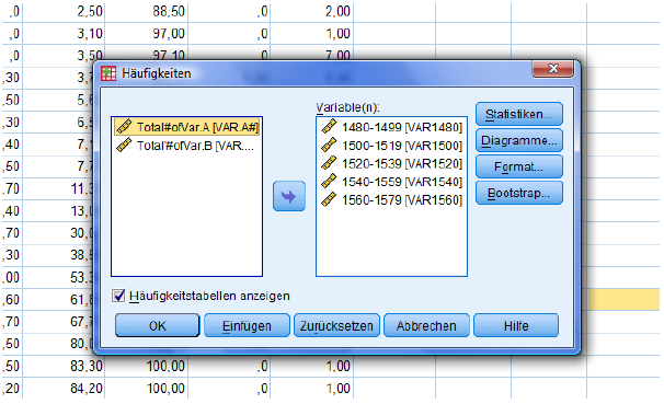
Select the first five columns/variables and choose 'Statistics'.
Table of frequencies needs not necessarily be activated.
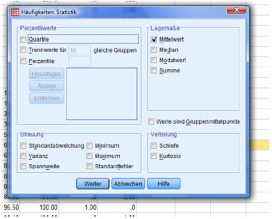
Activate 'Mean'. Press 'Continue' and 'OK'.
You will then get the following output:

Listed are the different means for each period.
You can see a positive development from 8.655 in the late 15th century to 94.8519 in the late 16th century.
Interpretation: You gradually ousted the historical subject form ye from the language within a century.
Now we want to depict this trend in two meaningful diagrams, a line chart and a boxplot diagram. How can we do this?
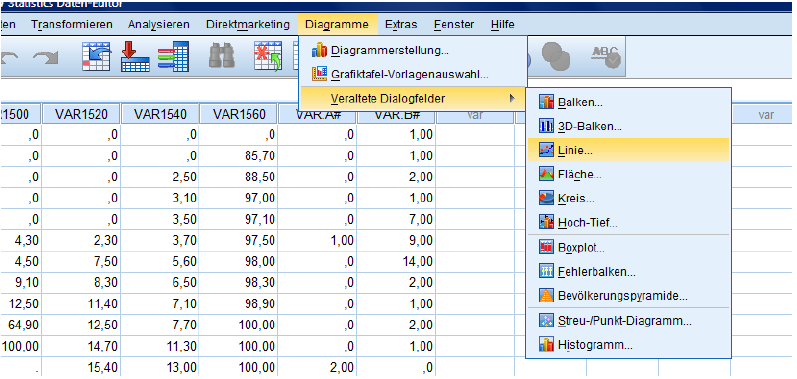
For the line chart, go to Diagrams … Other Dialogue Fields … Line Chart.
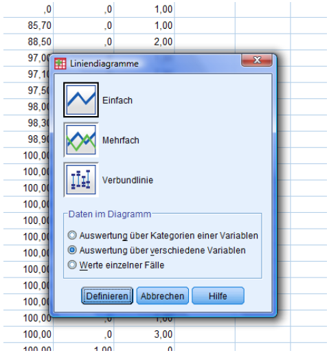
Activate:
-Single diagram
-Evaluation on different variables
Then, define!
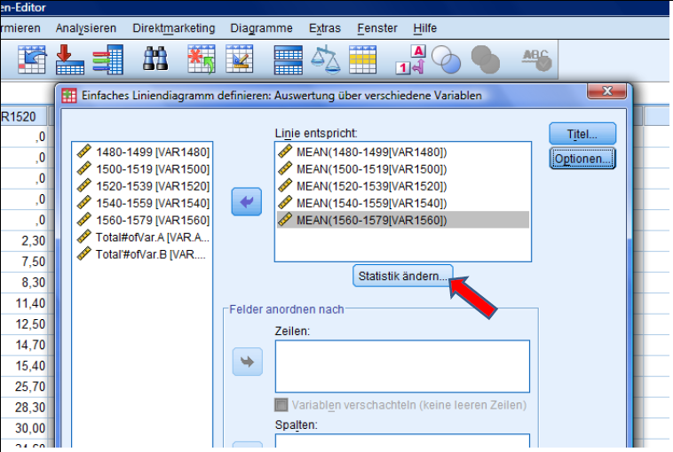
Put the first 5 Variables into the right box by clicking on the arrow. Then press change statistics.
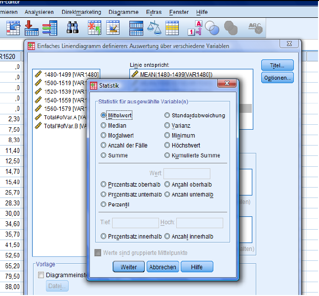
The only implement that needs to be selected is the mean.
Press continue.
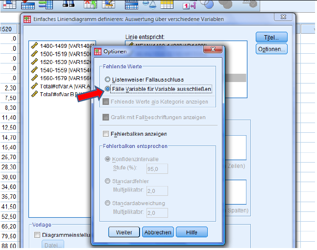
Select 'Options' and choose the 2nd option. Press continue and then 'OK' to execute the design of the graph.
Your output will be the following:
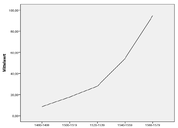
An increasing trend in the use of you over the decades is apparent.
For a boxplot diagram, take the following steps:
Go to Diagrams … other dialogue fields … Boxplot
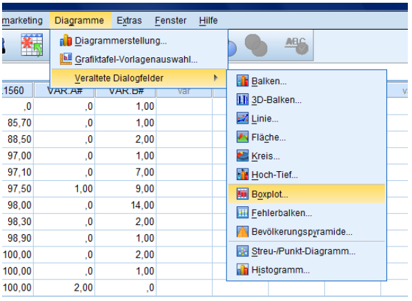
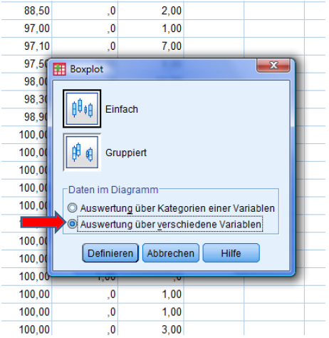
Select 'Single' and choose the 2nd option.
Hit define.
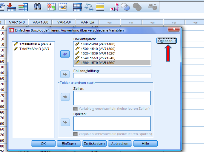
Select column/variable 1-5 and choose ‚Options‘.
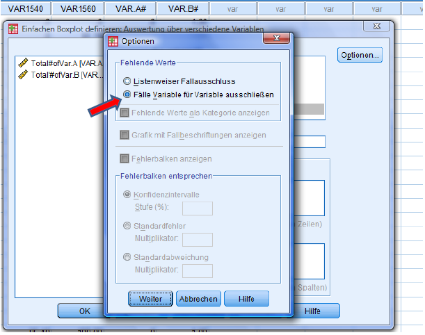
Again, choose the 2nd option, hit continue and then OK.
Your output is the following boxplot diagram:
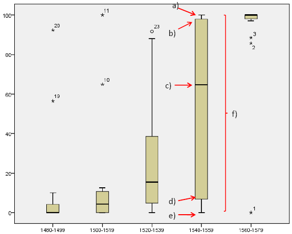
Explanation: a) Maximum b) Upper quartile (cuts off highest 25% of data) c) Median d) Lower quartile (cuts off lowest 25% of data) e) Minimum f) Full Range of distribution
Created with the Personal Edition of HelpNDoc: Generate Kindle eBooks with ease