In section 4.1.2.1., I introduced boxplots for datasets with one single dependent variable. Boxplots can also be used for comparing the respective combinations of one (or more) nominal independent variables and an interval/ratio-scaled dependent variable on the basis of the ‘five important numbers’ the boxplot depicts:
>.boxplot(dependentvariable~independentvariable, notch=T)
Also, if you simply want to get a boxplot without adding any other arguments, you can use the plot function and R will know that you ask for a boxplot (Gries 2009b: 133f.).
As we can see, the notches of the two boxplots overlap and the difference between the two medians is almost unrecognizable. The boxes and the whiskers are nearly the same, too, which all together implies that the two sets of values do not differ significantly from each other (Gries 2009b: 133f.).
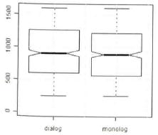
Fig. 12: Boxplot for LENGTH~GENRE (Gries 2009b: 133).
The last function for bivariate statistics I will discuss is scatterplot, which graphically shows the correlation between one interval/ratio-scaled dependent variable and one interval/ratio-scaled independent variable.
Conveniently, we can again use the generic plot function: R recognizes that both vectors contain numeric values and produces the default plot for this case, a scatterplot. As before, the first-named variable will be used for the x-axis (Gries 2009a: 211f.).
> plot(vector1, vector2)
or
> plot(dependentvariable~independentvariable,)
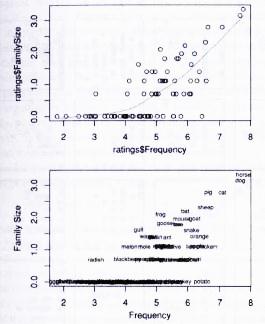
Figure 13: Scatterplots for Family Size as a function of Frequency for 81 English nouns. (modified after Baayen 2008: 35).
You can see that words with a very high frequency tend to have a very high family size. ln other words, the two variables are positively correlated.
In the scatterplot, a line highlighting the main trend can be added which is called a Scatterplot Smoother. The smoothing function is lowess (), which takes as input the X and Y coordinates of the data points and produces as output the X and Y coordinates of the smooth line. To plot this line, its coordinates are entered into lines () (Baayen 2008: 33f.):
> lines (lowess (vector1, vector2)
or
> lines(lowess(dependentvariable~independentvariable))
Concerning the latter function, it has to be explained that the variable one wants to be on the y-axis precedes the tilde, the one that is supposed to be on the x-axis follows the tilde (Gries 2009a: 213).
The added line in Fig. 13 shows that you have to proceed almost 2 log frequency units along the horizontal axis before beginning to see an increase in family size. For larger frequencies, the family size increases first slowly, but then faster.
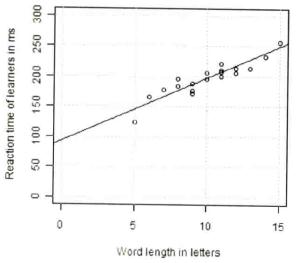
Fig. 14: Scatterplot with regression line for MS_LEARNER~LENGTH (Gries 2009b: 143).
Another option we have for inspecting the correlation is predicting values of the dependent variable on the basis of the independent variable, a so-called linear regression. It is represented by a straight line that is meant to represent the distribution of the scattercloud (Fig. 14). For this technique, please read Johnson (2008: 63f.) or Gries (2009b: 141ff.), who explain how to get the values and find the slope and intercept of the best-fitting line.
Created with the Personal Edition of HelpNDoc: Write EPub books for the iPad