Usually, research data sets do not only deal with just a dependent variable but also an independent one. If both are nominal, either a stacked bar plot or a mosaic plot is the right graph to create for representing this cross-tabulated data.
Compared to the bar chart (for univariate data), the bars of a stacked bar graph for bivariate data still represent the category values of one variable. However, each bar is divided into sub-bars by the second variable’s categories. These stacks of sub-bars represent the joint frequencies of any possible combination of the two variables’ categories.
For its use in R, we type in the function barplot and insert the name of the table we want to represent. A table in R is often called a matrix; both terms describe the same thing. In Fig. 9, the x axis is divided into NP and PP while the different colors represent animacy and inanimacy (Baayen 2008: 32):
> barplot(table, legend.text=c("anim", "inanim"))
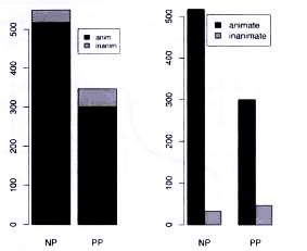
Fig. 9: Bar plots for the counts of clauses cross-classified by the realization of the recipient as NP or PP and the animacy of the recipient (modified after Baayen 2008: 32).
A mosaic plot, in comparison, gives the observer the same information as a stacked bar plot, just in a slightly different form: Still, each column represents one category. However, the columns and sub-bars do not represent the frequency but the percentage of each, measured by their column width and height (Gries 2009a: 192f.). The whole mosaic with all columns and rectangles together is 100 %. That means each rectangle now represents the joint probability of a certain combination of categories, not the joint frequency. For the mosaic plot, use the generic plot command. The first-named variable is used for the x-axis.
> plot(variable1, variable2, xlab="CONSTRUCTlON", ylab="CONCRETENESS")
There are several other ways to produce the same or a very similar graph, for example by using a formula as the main argument to plot. Such a formula consists of a dependent variable, a tilde ~, and an independent variable (Gries 2009b: 129f.):
> plot(dependentvariable~independentvariable)
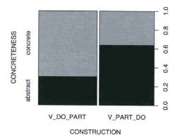
Fig. 10: Mosaic plot of the distribution of verb-particle constructions (Gries 2009a: 194).
Another graph for summarizing cross-tabulated data is a line plot. I agree with Gries (2009b: 131f.) and do not recommend using this kind of graph for nominal data, since its lines suggest continuous values between the categories of the variable that of course cannot exist. In case you still would like to take a look at the explanation of the graph, please confer Gries (2009b: 131f.).
In case the data set provides a nominal dependent variable and an interval/ratio-scaled independent variable, one can use the function spineplot:
> spineplot(dependentvariable~independentvariable)
In Fig. 11, the y-axis represents the dependent variable Filler split into the three levels silence, uh and uhm, and the x-axis shows the independent variable Length of the disfluencies in milliseconds. The x-axis is split up into the value ranges that would also result from hist (which means you can change the ranges with breaks=...) (Gries 2009b: 130ff.). As Gries (2009b: 130) admits himself, it does not make much sense to describe Filler as dependent on Length, but it is a graphical example of a spine plot with a data set he had at hand.
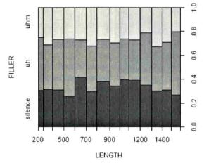
Fig. 11: Spineplot for FILLER~LENGTH (Gries 2009b: 130).
Created with the Personal Edition of HelpNDoc: Free PDF documentation generator